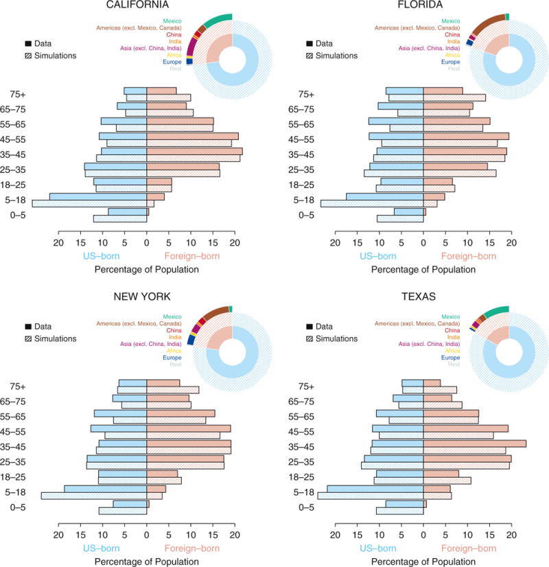
Figure 2.

Comparisons of state-level demographic data and model simulations. For each of the four states (California, Florida, New York, and Texas), the pie charts show the size of the population that are U.S. (in light blue) and foreign (in pink) born, and their further subdivisions by eight regions: (1) Mexico, (2) Americas excluding Mexico and Canada, (3) China, (4) India, (5) Asia excluding China and India, (6) Africa, (7) Europe, and (8) rest of the world. The horizontal bars show the distribution of the population (light blue showing U.S. born, and pink showing foreign born) by age categories indicated on the side. The data (solid bars) are obtained from 5-year estimates (2009–2014) of the American Community Survey. Shown in hatched bars are the distributions in simulations of the calibrated models for each of the states.
