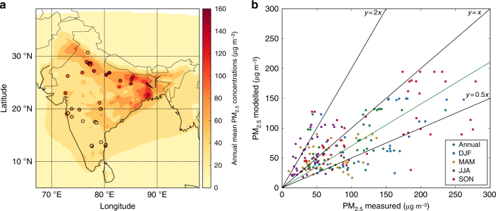
Fig. 1.
Comparison of observed and simulated PM2.5 concentrations. a Annual mean surface PM2.5 concentrations. Model results for 2014 (background) are compared with surface measurements from 2016 (filled circles). b Comparison of annual and seasonal mean surface PM2.5 concentrations. The best fit line (green), 1:1, 2:1 and 1:2 lines are shown (black). Annual, winter (DJF), spring (MAM), summer (JJA) and autumn (SON) normalised mean bias (NMB) are −0.10, −0.24, −0.07, 0.69 and −0.10, respectively. The best fit line for annual data has slope = 0.70 and Pearson’s correlation coefficient (r) = 0.19

