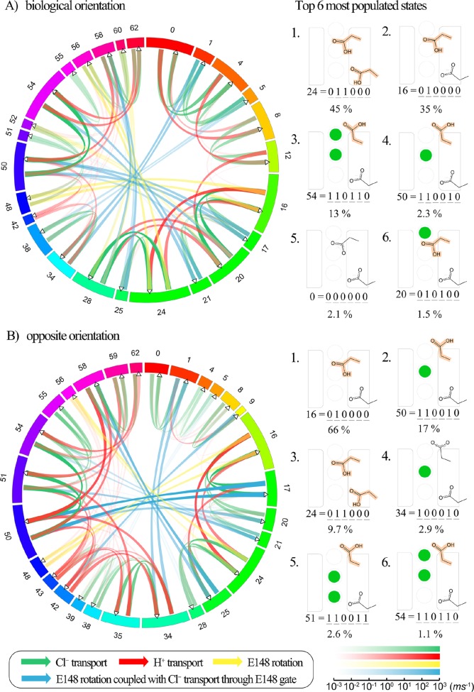
Figure 7.
Circular network graph created using Circos61 displaying median overall transition rates for the final 10 solution sets. The system is under symmetric pH 4.5 on both sides, and 300 mM/1 mM Cl– gradient through the membrane. Protein is placed in the biological orientation in (A), and in the opposite orientation in (B). The states are shown sequentially in the clockwise direction, with the numbers corresponding to states as shown in Figure 3; the colors are added only to distinguish between states. The fraction of the circumference corresponds to the relative population of each state during state to state ion exchange, scaled by logarithm. For simplicity, the states with a very low population (less than 10–6) are not shown. The lines in the center of the circle represent incoming flux (left) and outgoing flux (right), indicated by the arrow directions. The thickness and the transparency of the color of the flux correspond to the flux rate, logarithmically scaled. The color scale bar for the flux rate (in the unit of ms–1) is shown on the bottom right corner. For each orientation, the top six most populated states and the probability of each state are shown on the right.

