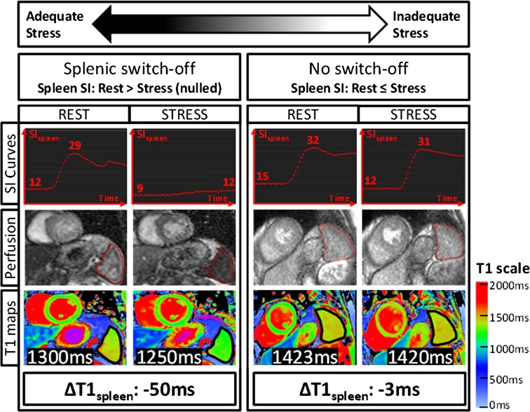
Fig. 6.
Representative stress and rest splenic first-pass gadolinium perfusion and native T1 maps. Signal intensity (SI) curves represent splenic perfusion SI (y-axis, arbitrary units) over time (x-axis, 50–60 s). The maximum and minimum SIspleen are as indicated. Splenic regions of interests on perfusion images and T1 maps are outlined in red and black, respectively. Mean native T1spleen and stress changes (ΔT1 spleen) are as labelled. 3 T images were used for illustration (observed ΔT1 spleen and ΔSI spleen are field strength-independent).
As originally published by BioMed Central in Liu et al. [29] (color figure online)

