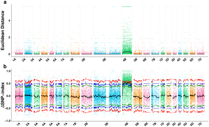
Figure 2.
Identification of the target regions through two types of association analysis methods. (a) The results of Euclidean Distance association analysis. The x-axis represents the wheat chromosomes and y-axis represents the Euclidean Distance value. The black lines show all fitting results of ED, the red dotted line shows the threshold of ED. The larger the result of ED is, the stronger the association is. The association threshold was 0.23. Peak regions are defined as regions where the Loess-fitted values are greater than the threshold value (P < 0.01). (b) The results of ΔSNP-index association analysis. The x-axis represents the wheat chromosomes, and the y-axis represents the ΔSNP-index values. Black lines are the average values of ΔSNP-index drawn by sliding window analysis. The red (P < 0.01), blue (P < 0.05) and green (P < 0.1) lines are the threshold values, which was calculated by Loess regression. Peak regions are defined as regions where the smooth value s are greater than the threshold value.

