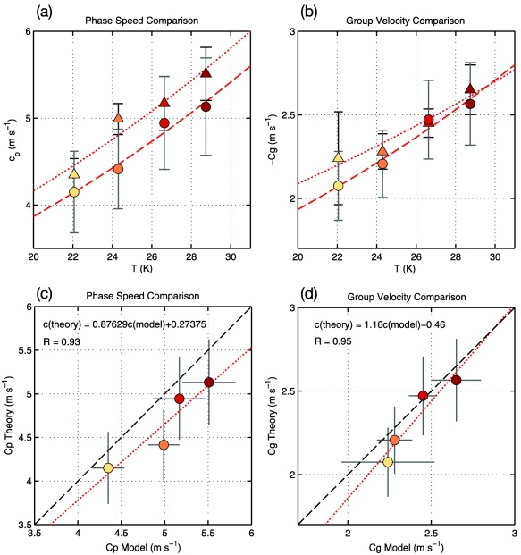
Figure 9.

Comparison of the (a) phase speed and (b) group velocity inferred from the time‐longitude diagrams of Adames et al. (2017) (triangles) and estimated from equations (9a) and (9b) (circles). The corresponding nonlinear least squares fit are shown as red dotted and dashed lines, respectively. The confidence interval for each estimate is shown as an error bar. (c) and (d) Scatterplots of the phase speed and group velocity estimated from theory (y axis) with those inferred from Adames et al. (2017) (x axis). The 1‐1 line is shown as a dashed line and the linear least squares fit is shown as a red line. The linear regression coefficients and the correlation are shown in the top left.
