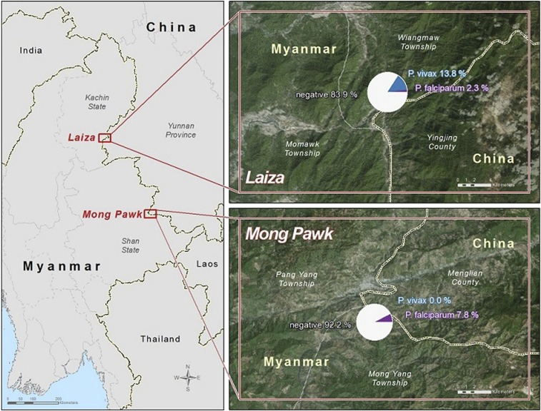
Figure 1.
Web-based map of malaria prevalence in study sites. In the inserts showing Mong Pawk and Laiza sites, the white, blue, and purple color in the pie chart represents the proportion of study participants with no, Plasmodium vivax, and Plasmodium falciparum malaria, respectively. This figure appears in color at www.ajtmh.org.

