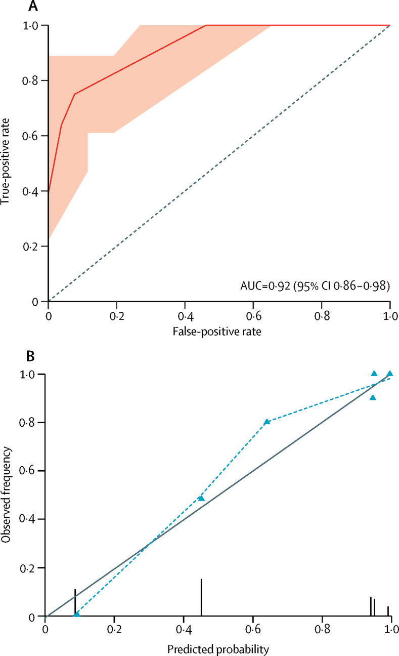
Figure 2.
Discrimination and calibration measures of prediction model performance
(A) Receiver operating characteristic curve for predicted probability of moderate or severe CAA. The AUC is equivalent to the c statistic. The shaded area represents the 95% CI of the AUC based on 2000 bootstrap replicates. The dotted line indicates a non-informative AUC of 0·50 for comparison. (B) Calibration plot of predicted probability versus observed frequency of moderate or severe CAA. Grey line indicates perfect calibration, the model's calibration is shown by the dotted line. Triangles represent the six different moderate or severe CAA risk groups produced by the prediction model. Vertical lines represent the frequency and distribution of model predicted probabilities. CAA=cerebral amyloid angiopathy. AUC=area under the curve.

