
Figure 3.
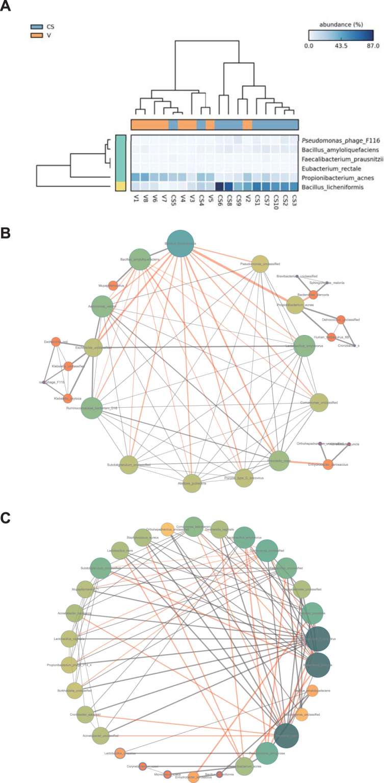
Correlation of the predominant microbiomes under different modes of delivery. (A) Heat map analysis generated with LEfSe showing the taxonomic strains with significantly different abundance in C-section and vaginally delivered neonates. The dendrogram of pathway abundance is colored red to indicate a negative LDA score and green to indicate a positive LDA score. Over/underrepresentation is depicted by a color gradient. (B,C) Correlations were expressed by Spearman’s correlation coefficients. Only the first 30 abundant species were analyzed. Network analysis of C-section-delivered infant meconium microbes (B) and vaginally delivered infant meconium microbes (C). Nodes indicate taxonomic affiliations at the species level. Red lines indicate negative correlations; gray lines indicate positive correlations. The line thickness represents the correlation strength. The size of a node is determined by the thickness of all lines on the node.