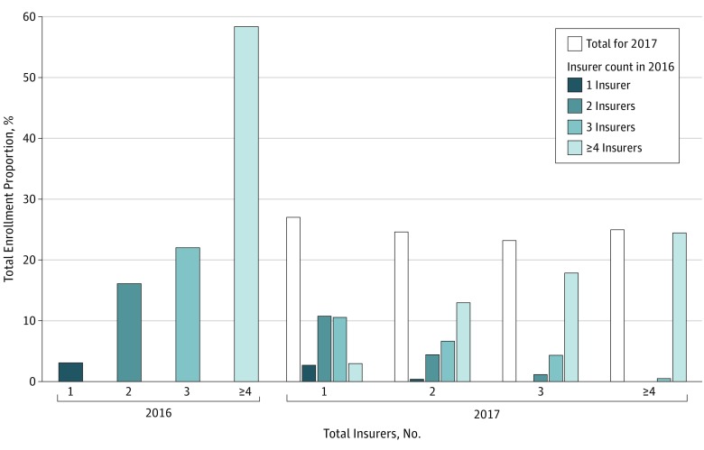
Figure 1. Distribution of Total Insurer Count by Enrollment in 2016 and 2017.
Height of each bar in 2016 and height of the open bars in 2017 represent the percentage of total enrollment in counties for the total insurer count indicated. Colored bars in 2017 represent distribution of the total insurer count by enrollment in 2016. For example, among counties with 1 insurer in 2017, 10% of counties had 1 insurer, 40% had 2 insurers, 39% had 3 insurers, and 11% had at least 4 insurers in 2016. This distribution is weighted by the county-level plan enrollment in 2016.

