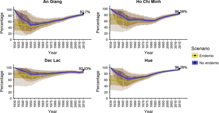
Fig 7. The predicted susceptible proportions over time from the best model in each location.
In all locations, the boxplots represent the generated proportion with its 95% credible intervals (also shown 1st quartile, 3rd quartile, and the medians) with the solid lines showing the mean value of each interval. The two scenarios, with or without endemic transmission before in 1930 are shown in the plot by yellow and blue respectively. The black dots are the age-adjusted seropositive proportions from our serosurvey in 2015.

