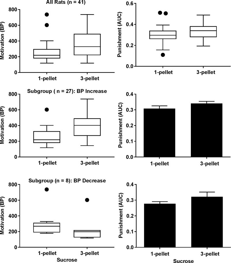
Figure 3.
Impact of different motivational levels for sucrose on the punishment sensitivity. Upper left panel: box and whisker plot showing an increase in the BPs at the group level (Wilcoxon signed-rank test, p < 0.001). Upper right panel: box and whisker plot showing no significant change in the AUCs at the group level (Wilcoxon signed-rank test, p = 0.06). Middle left panel: box and whisker plot showing an increase in the BPs in a subgroup in response to increased sucrose value (Wilcoxon signed-rank test, p < 0.001). Middle right panel: bar graph showing no significant change in the AUCs within the BP-increasing subgroup (paired t test, p = 0.12). Lower left panel: box and whisker plot showing a decrease in the BPs in a subgroup in response to increased sucrose value (Wilcoxon signed-rank test, p < 0.01). Lower right panel: bar graph showing no significant change in the AUCs within the BP-decreasing subgroup (paired t test, p = 0.18). Data are represented as mean ± SEM in the bar graph. The box extends from 25th to 75th percentile. The upper whisker represents the largest value smaller than the sum of the 75th percentile and 1.5 times the inter-quartile distance or the maximum of the data if the maximum is smaller than the sum. The lower whisker represents the smallest value greater than the difference between the 25th percentile and 1.5 times the inter-quartile distance or the minimum of the data if the minimum greater than the difference. The filled circles represent data beyond the whiskers.

