Figure 4.
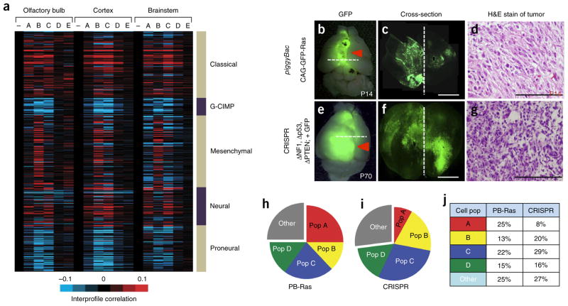
Identification of analogous populations in malignant glioma. (a) Heat map showing intersample Pearson’s correlations (red, positive; bright red or blue denotes r-value > 0.1 or < −0.1, respectively, across ~7,000 genes) between mRNA profiles of astrocyte populations (columns; genes within each region first centered on corresponding control group) and mRNA profiles of human glioblastoma (rows; from the Cancer Genome Atlas (TCGA), n = 528 cases). Note that minus sign represents the Aldh1l1–GFP-negative control population. (b–d) Representative images P14 from the piggyBac-Ras model of malignant glioma (n = 6). (e–g) Representative images at P70 from the CRISPR model of malignant glioma (n = 6). Images in b,e are from whole brain; dashed lines represent cortical midline. The dashed lines in b and e are the planes of section in c and f, respectively. Scale bars, 2,500 μm (c,f) and 250 μm (d,g). H&E, hematoxylin and eosin. (h–j) Pie charts showing the representative subdivision of bulk, GFP+ tumor cells through the combinatorial use of the CD51 and CD71 cell surface markers. Data are representative of eight independent FACS experiments. Gray fraction represents CD133+ GSCs and CD31+ endothelial cells; cell population and marker coding is the same as described in Figure 1c. PB-Ras, piggyback-Ras. Filled red arrows denote tumor.

