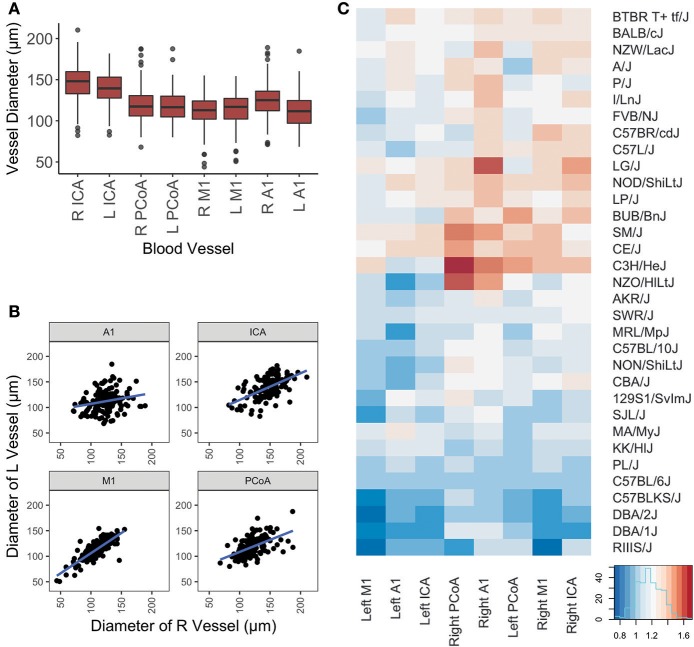
Figure 2.
Graphical representation of vessel diameters. (A) Boxplot depicting distribution of measurements for each vessel. Box represents 1st quartile through 3rd quartile, with line indicating median. Whiskers extend no more than 1.5x the interquartile range. Data points beyond that are represented by a dot. (B) Scatterplot of left vs. right diameters for each vessel included in this study. Linear regression lines are depicted for each artery. (C) Graphical display of mouse vessel diameters by strain. Normalized mean vessel diameters were used to cluster strains, which are shown in a heatmap to provide visualization of the vascular patterns for each strain.

