. 2018 Jan 23;7:e30649. doi: 10.7554/eLife.30649

Figure 3. WGCNA yields behaviorally relevant modules.

(A) Dendrogram (top) illustrates the topological overlap between genes in the juvenile Area X overall network. Modules delineated by automated tree trimming are shown below and are depicted by arbitrary colors. Beneath the color bar, gene significances to the quantified behaviors (number of motifs sung, tutor similarity, acute variability changes, and overall variability; see Results) are indicated by a heatmap wherein red indicates a positive correlation and blue indicates a negative correlation (see B for scale). (B) Correlations between module eigengenes and each behavior are presented as a heatmap. The Pearson’s ρ and, in parentheses, Student’s asymptotic p-values for modules where p≤0.05 are displayed. P-values are uncorrected for multiple hypothesis testing but those that pass FDR correction at p≤0.05 are denoted by * (See ‘Correlation of behavior to gene expression’ in Materials and methods). (C) For all significant module-trait correlations, the relationship between gene significance and module membership is plotted for each gene in the module. Dashed lines represent the linear regression and the Pearson’s ρ (‘cor’) and p-value as determined by Fisher’s z-transformation are indicated above each plot. (D) The average whole network connectivity (kTotal) within each module reveals that the purple, green, and pink modules are composed of the most strongly connected genes in the network. (E) Term significances for the black, darkred, and green modules are indicated for disease, gene ontology biological process and molecular function, as well as for pathways for categories annotated as ‘neuronal’ in the GeneCards GeneAnalytics software. (F) Network plots of the modules presented in panel E where nodes represent genes scaled by the node’s intramodular connectivity and edge width displays the topological overlap between genes.

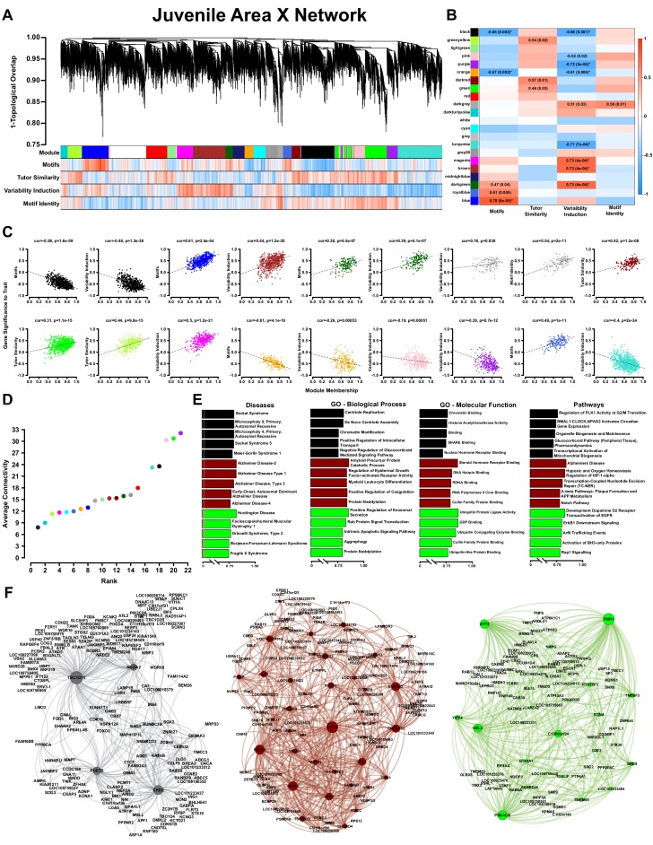
Figure 3—source data 1. The behavioral metrics that were correlated to the network to generate (A) and (B).
DOI: 10.7554/eLife.30649.019
Figure 3—source data 2. An R workspace containing the network presented in (A).
DOI: 10.7554/eLife.30649.020
Figure 3—source data 3. An R workspace containing the processed expression data for the network presented in (A).
DOI: 10.7554/eLife.30649.021
Figure 3—source data 4. The Pearson correlation values for each module eigengene and the behavioral metrics in Figure 3—source data 1.
These data are the basis for panel 3B.
DOI: 10.7554/eLife.30649.022

Figure 3.

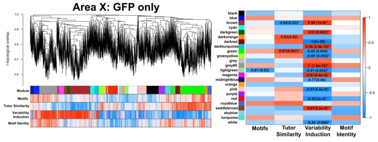
Figure 3—figure supplement 1. GFP-only Area X network.

Figure 3—figure supplement 1.

A gene coexpression network built only from GFP birds is presented. Significant module-trait correlations are shown in a heatmap, right. Colors are consistent with Figure 3A.
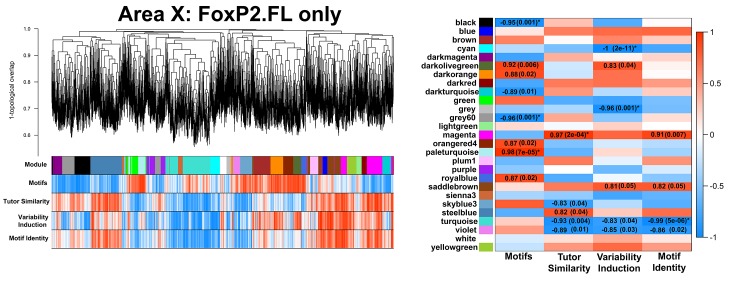
Figure 3—figure supplement 2. FoxP2.FL-only Area X network.

Figure 3—figure supplement 2.

A gene coexpression network built only from FoxP2.FL birds is presented. Significant module-trait correlations are shown in a heatmap, right. Colors are consistent with Figure 3A.
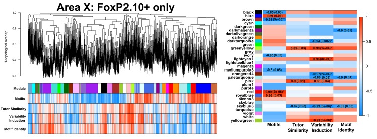
Figure 3—figure supplement 3. FoxP2.10+-only Area X network.

Figure 3—figure supplement 3.

A gene coexpression network built only from FoxP2.10 + birds is presented. Significant module-trait correlations are shown in a heatmap, right. Colors are consistent with Figure 3A.
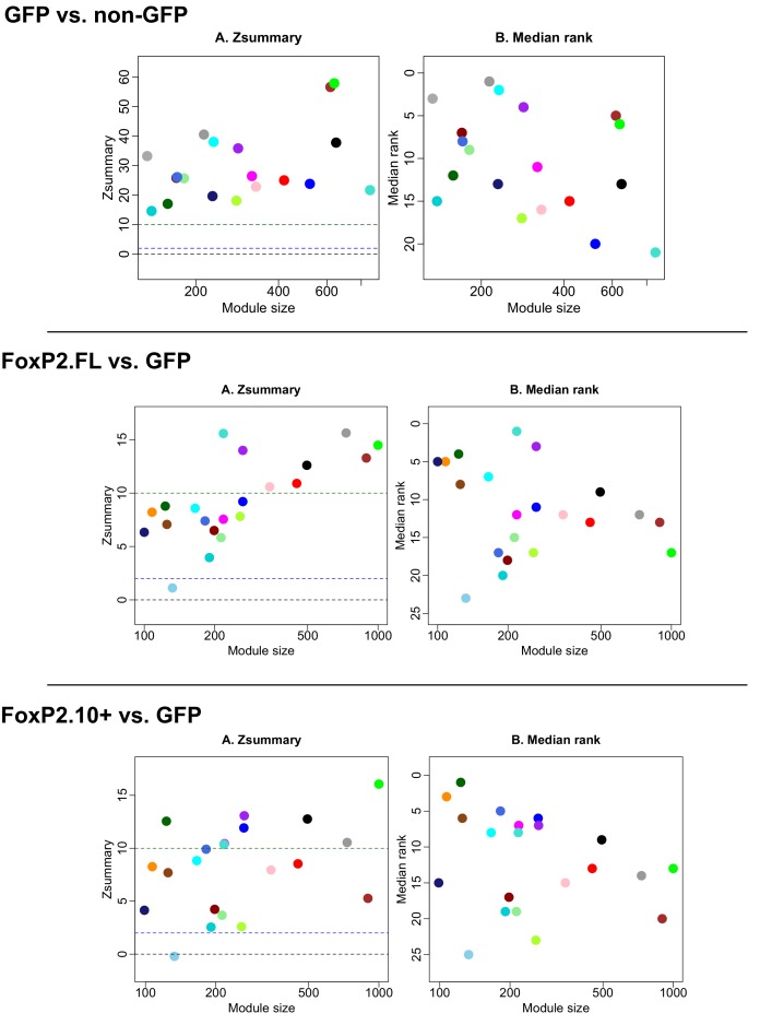
Figure 3—figure supplement 4. Module preservation between GFP vs FoxP2.

Figure 3—figure supplement 4.

FL and FoxP2.10+ combined, GFP vs. FoxP2-FL, and GFP vs. FoxP2.10+ networks. Plots depict module preservation vs. module size for each virus construct pair and allow for visual assessment of whether a specific module exists in two conditions. Middle and upper dashed horizontal lines indicate thresholds for low and high preservation, respectively.
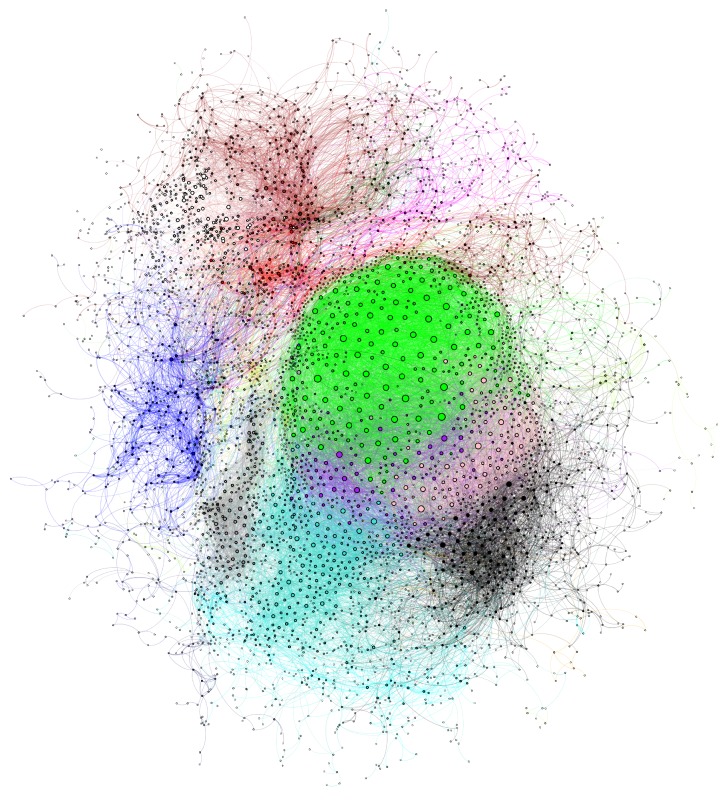
Figure 3—figure supplement 5. Juvenile Area X gene coexpression network.

Figure 3—figure supplement 5.

The gene coexpression network is displayed with genes represented as nodes and colors indicating the module assignment of each gene. Nodes are scaled by their degree and edge color is the combination of the module colors of nodes connected by the edge. Poorly connected nodes are excluded (see Methods).
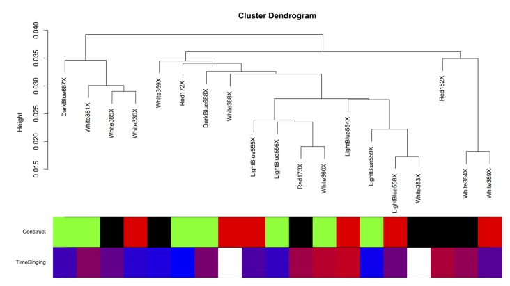
Figure 3—figure supplement 6. Intersample correlation for Area X samples.

Figure 3—figure supplement 6.

The intersample correlation for the Area X samples does not clearly delineate clusters by virus construct. Virus construct is indicated in green (GFP), black (FoxP2.FL), and red (FoxP2.10+). Below, time singing is indicated on a blue-red color scale where the samples from birds that sang the most are colored the deepest red.