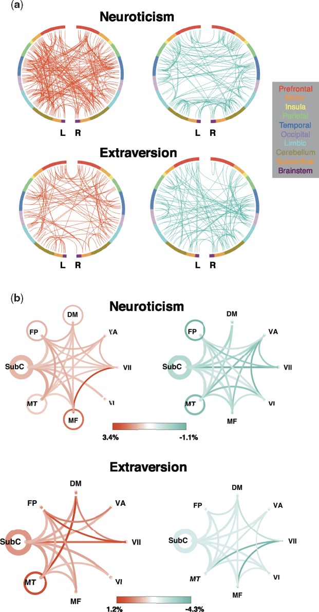
Fig. 2.
Canonical network pairs in positive and negative prediction. (a) Edges between macroscale regions. Each semicircle represents a hemisphere of the brain, and nodes are organized around the circle by anatomical location. Edges are represented by lines; red edges are stronger in individuals with higher scores, and blue edges are stronger in individuals with lower scores. (b) Proportion of total edges of each canonical functional network pair utilized in prediction, calculated by dividing the number of edges in each network pair included in prediction by the total number of possible edges between that pair of networks. The higher the proportion, the more ‘utilized’ the network pair is in prediction. Orange represents higher utilization in positive prediction and green represents higher utilization in negative prediction. Line saturation indicates the proportion of edges of the particular network pair involved in prediction: the darker the line, the higher proportion. Line width indicates the total number of edges possible in the pair: the thicker the line, the more possible edges. Curves show between-network connections and circles show within-network connections.

