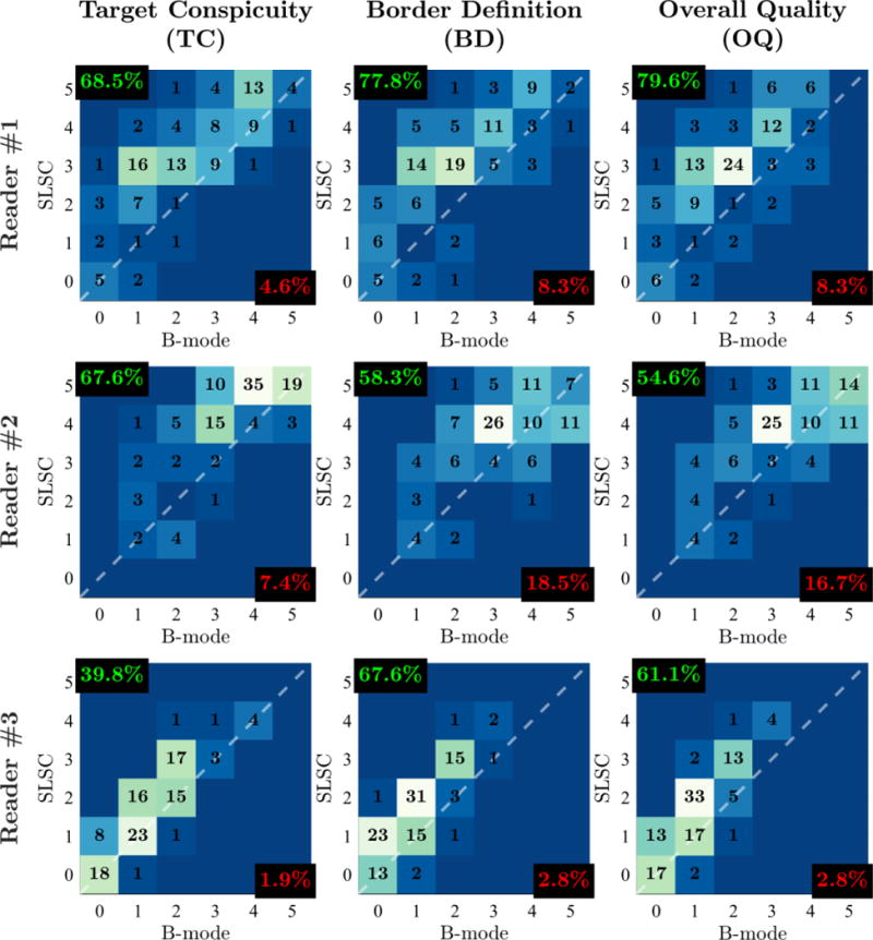
Figure 6.

Outcome measure score distributions for Readers 1, 2, and 3. Histograms are organized in columns for different outcome measures (TC, BD, OQ) and in rows for different readers. Individual histograms depict the number of matched video pairs in different score categories with SLSC score plotted as a function of B-mode score. The dashed white lines denote categories in which SLSC and B-mode scores are the same. Video pairs above this diagonal indicate increase in outcome measure score from B-mode to SLSC. For each histogram, the percentage of video pairs with SLSC preference and B-mode preference are indicated in the top-left and bottom-right corners, respectively.
