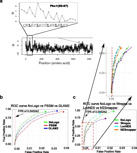
Fig. 4.

Predicting NESs using the NoLogo model. a shows the log likelihood ratio score over a portion of Pkc1, inset is the region corresponding to the known NES. b shows ROC curves of NoLogo prediction performance on the NESdb vs PSSM and GLAM2 respectively. The dotted red line indicates the false positive rate, at which we evaluate the predictions at a proteome wide level. c The relative prediction performance of NoLogo, Wregex, LocNES and NESmapper, by ROC curve analysis. Above is a zoomed-in image of the bottom left quadrant of the graph representing the true positive rates at low false positive rates. See text for details
