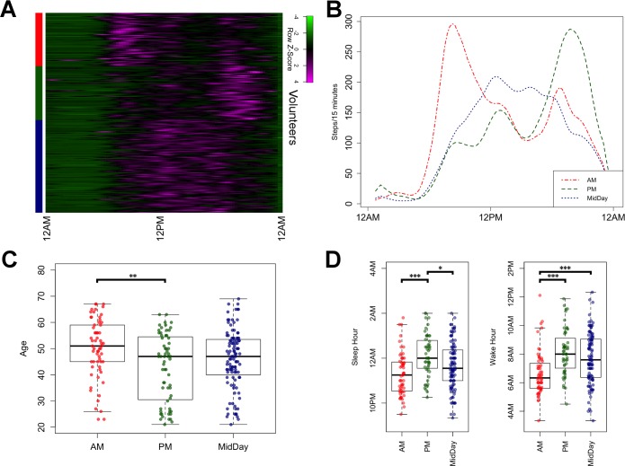
Fig 1. Stratification of volunteers based on wearable-derived activity metrics.
(A) Heatmap showing activity profiles of study subjects over a 24-hour period, grouped by cluster (red = AM, green = PM, blue = MidDay). (B) Average activity profiles of the AM, PM, and MidDay clusters, respectively. (C) Boxplots showing the age distribution of each cluster. (D) Distribution of sleep and wake times for each cluster. The code to generate this figure can be found in S2 Data. Asterisks denote significance of Tukey’s range test between cluster pairs. * = p < 0.05; ** = p < 0.01; *** = p < 0.001.

