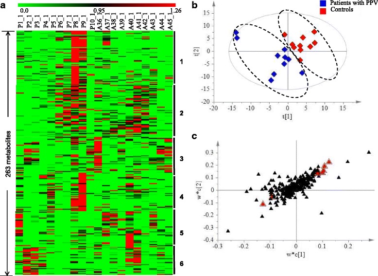
Fig. 1.

Metabolic variation between the controls and patients after PPV. a Heat map representation of 263 metabolites detected in 20 AH samples, showing 6 classes by clustering analysis. Each line represents one metabolite. The deeper the green color, the lowest its content in the AH sample; similarly, the deeper the red color, the highest its content in the AH sample. b PLS-DA score plot for the first two components (t[2] / t[1]) model for the controls and patients after PPV. c PLS-DA S loading plot for the two first components (w*c[2] / w*c[1]) for the controls and patients after PPV. Metabolites responsible for separation are labeled with red triangle
