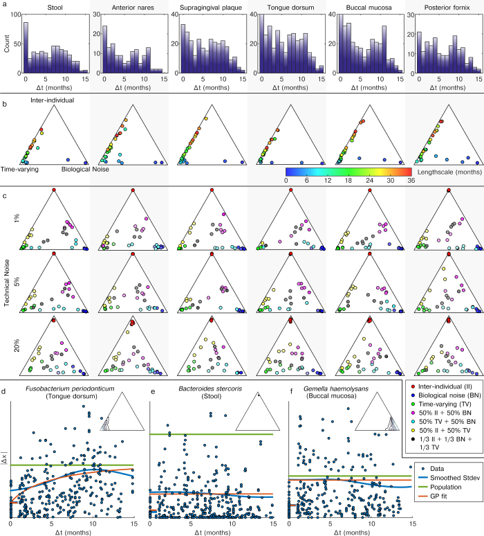
Extended Data Figure 4. Sampling interval distribution, parameter fits for simulated samples, and examples of microbial species abundance dynamics and corresponding Gaussian process fits.
a, Distributions of differences in time between samples at each targeted body site. Technical replicates are shown as Δt = 0. b, Parameter fits for simulated samples with U = 0, B = 0, T = 0.95, N = 0.05, and varying l (see Methods). Simulated samples were drawn with the real sample distribution and count from each site, to show how limitations in sampling at certain sites alter the fidelity of the fits. c, Parameter fits for five simulated samples with each of the three pure components (coloured red, green and blue), as well as all even mixtures of pairs of them (for example, yellow points are even mixtures of U and T), and even mixtures of all three (black), for differing levels of technical noise (N) and fixed l = 0.5. Uncertain inferences are more desaturated. d–f, Three examples of taxonomic profiles fit with the Gaussian process model are shown on plots designed to allow a direct comparison between the data and the fit Gaussian process, and allow the different dynamics to be visualized despite the limit of only up to three time points per person. Each example was chosen as an exemplar of one of the three non-technical components in the model. Insets denote confidence deciles of the MCMC samples. The abundance of Fusobacterium periodonticum in the tongue dorsum shows strong time-varying behaviour (d), Bacteroides stercoris in stool shows mostly inter-individual differences (e), and Gemella haemolysans in the buccal mucosa is dominated by biological noise (f). The plots show the absolute difference in arcsine square-root transformed microbial abundance (|Δx|) between pairs of samples from the same person against the difference in time between samples (points). A Gaussian-smoothed estimate of the standard deviation of the points is also shown (blue line, bandwidth three months), along with the expected difference from the fit Gaussian process (red line). The standard deviation of differences between technical replicates (points with Δt = 0 months) is also shown as the line stub at the origin, directly visualizing the level of technical noise. Biological noise is visible here as the difference between technical noise and the variance of the remaining points extrapolated to the origin. The time-varying component is visible as a gradual increase in the variance of the differences over time (that is, gradually increasing red and blue lines). Finally, inter-individual differences are visible by comparing the limit of the variance of the data with the variance of differences between subjects (green line).

