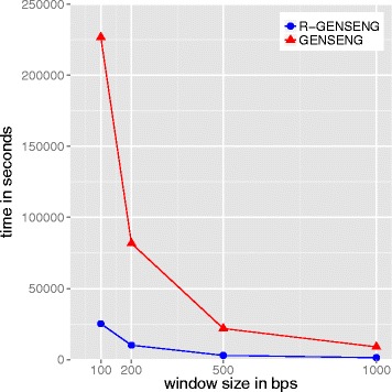
Fig. 2.

Running time of the real data with different window sizes. The x-axis is the window size and the y-axis is the running time (in seconds). The red curve connects the points representing the average running time of GENSENG at varying window sizes and the blue curve connects the points representing the average running time of R-GENSENG
