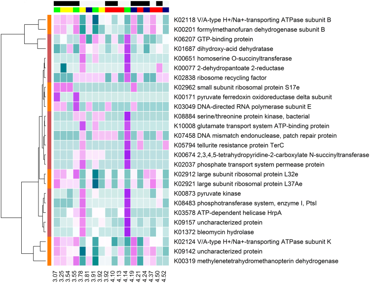
Figure 2.
Heat map of the relative abundance of microbial genes associated with N isotopic discrimination as identified in the partial least squares analysis. The relative abundance of microbial genes (aqua = low to purple = high) changed depending on N isotopic discrimination. The coloured bars on the horizontal axis represent diet (CONT = yellow, LIPID = green, NIT = blue, COMB = red) and FCE (low = light grey, high = black). Coloured bars on the vertical axis represent the cluster in which genes were located (red = cluster 2, and orange = cluster 5). The values on the x-axis represent the corresponding Δ15N values for each animal arranged in ascending order.

