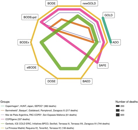
Fig. 1.

Network plot. Network representing which prognostic scores belong to the different groups. Each node represents a score and each closed polygon represents a group of cohorts where the same prognostic scores are available. The thickness of the lines represents the total number of deaths in the specific group
