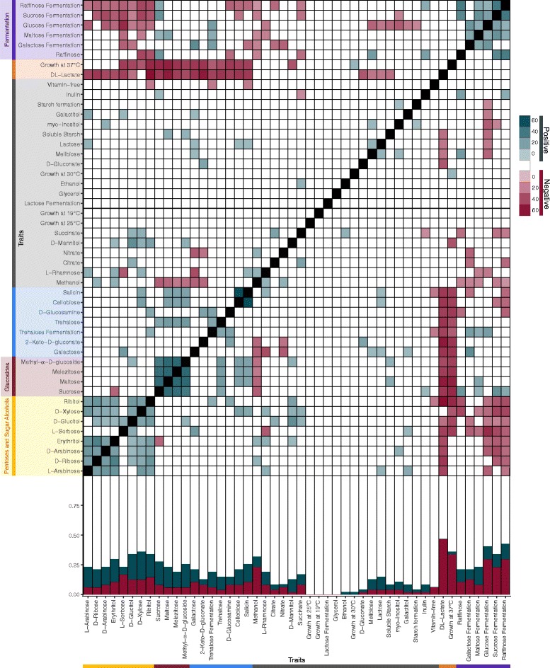
Fig. 1.

Traits showed pairwise positive and negative associations, but the numbers and strength of association varied among traits. Bottom: Stacked bar graph displaying the proportion of negative (red), positive (blue), and not significant (white) associations for all traits. Top: Heat map of pairwise associations among traits. The color of a box represents the type of association: negative (red), positive (blue), and not significant (white). The strength of the association (the difference between the observed and expected counts) is displayed by the saturation of the color. We used a hierarchical cluster analysis to determine significant trait clusters with similar pairwise trait associations (Additional file 3: Figure S1; q < 0.05). Selected trait clusters are represented by the colors along the left-hand side and bottom of the graph
