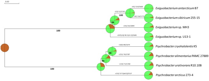
Fig. 7.
—Evidence of gene gain and loss using reciprocal BLASTp analysis. The dendrogram was obtained in the BlastGraph software. Bold numbers represent the percentage of bootstrap values. Numbers in each branch of the tree represent the number of gene families that were gained (+) or lost (−) compared with their closest ancestor. The circular graph is a graphical representation of the gain/loss analysis. The green color represents the conserved families while the brown color represents the gained families.

