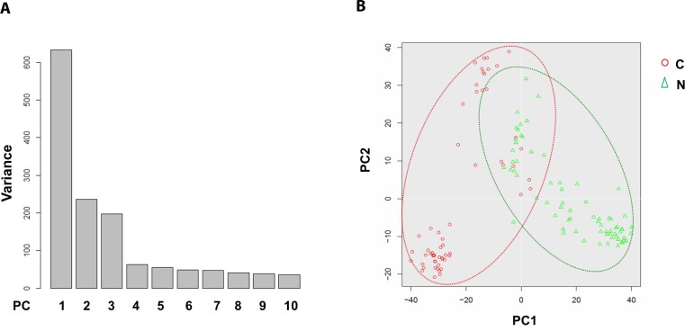
Figure 3. Principal component analysis of cancerous versus control EC libraries.
PCA screen plot indicates that PC1-3 could well explain the whole variance of the database (A). 2D PCA plot shows two distinct clusters along the PC1 axis that correspond to the cancerous ECs (red circle, C) and control ECs (green triangle, N) with 8 cancerous ECs overlapping into the control EC cluster (B).

