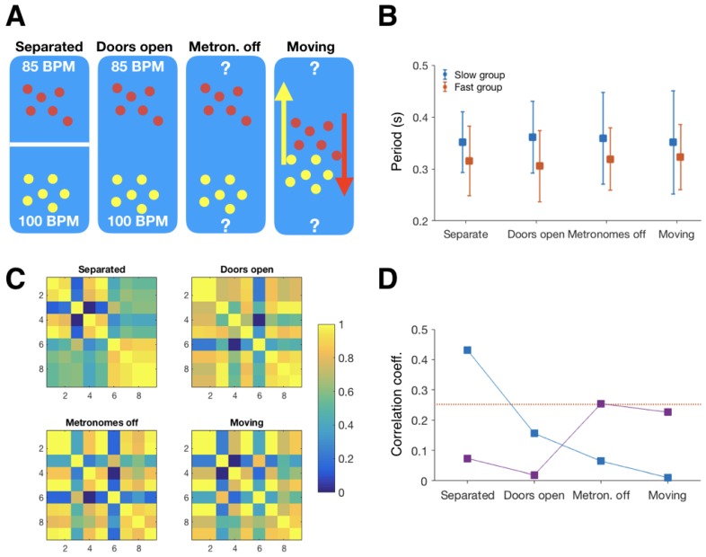
Figure 2.
(A) Structure of the rhythm battle protocol. (B) Average tempi in each of the segments. Data from the second group. Error bars represent averages of individual participant’s tempo variability. (C) Tempo similarity matrix from the second group. Yellow represents high similarity and dark blue dissimilarity. Values are normalised. (D) Correlations between tempo similarity matrices and group membership (blue), and tablet-IOS scores and tempo similarity (purple). Red dotted line indicates the threshold. Data from second group.

