
Figure 9.
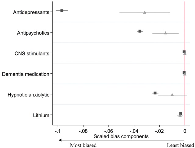
Bias component plots: difference in patients’ prescriptions received in the previous year by actual prescription (▪) and proposed instrument ( ). The figures for the instrumental variable results account for the strength of the instrument as described in Jackson and Swanson (2015).27 The horizontal lines indicate robust confidence intervals for each prescription. There is little evidence of differences in the prescribing history when the confidence intervals span zero on the axis.