Figure 2.
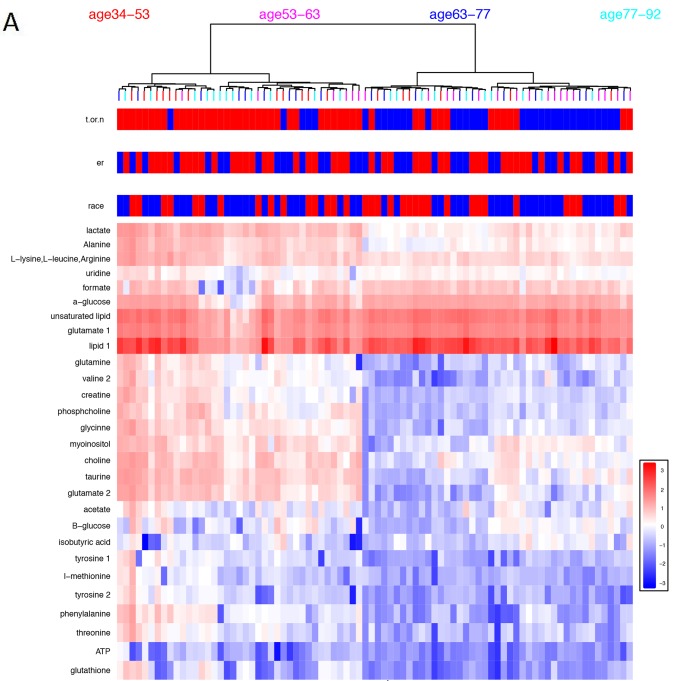
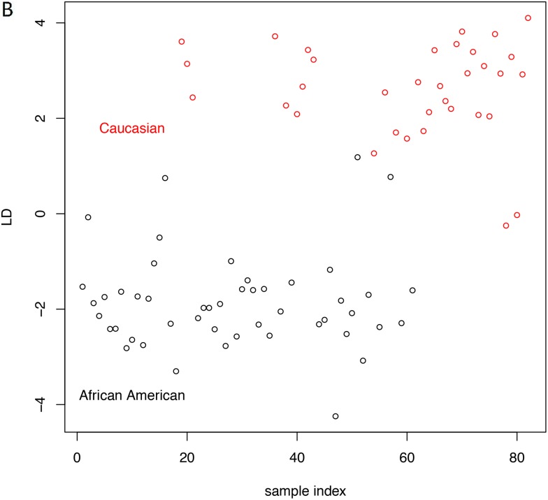
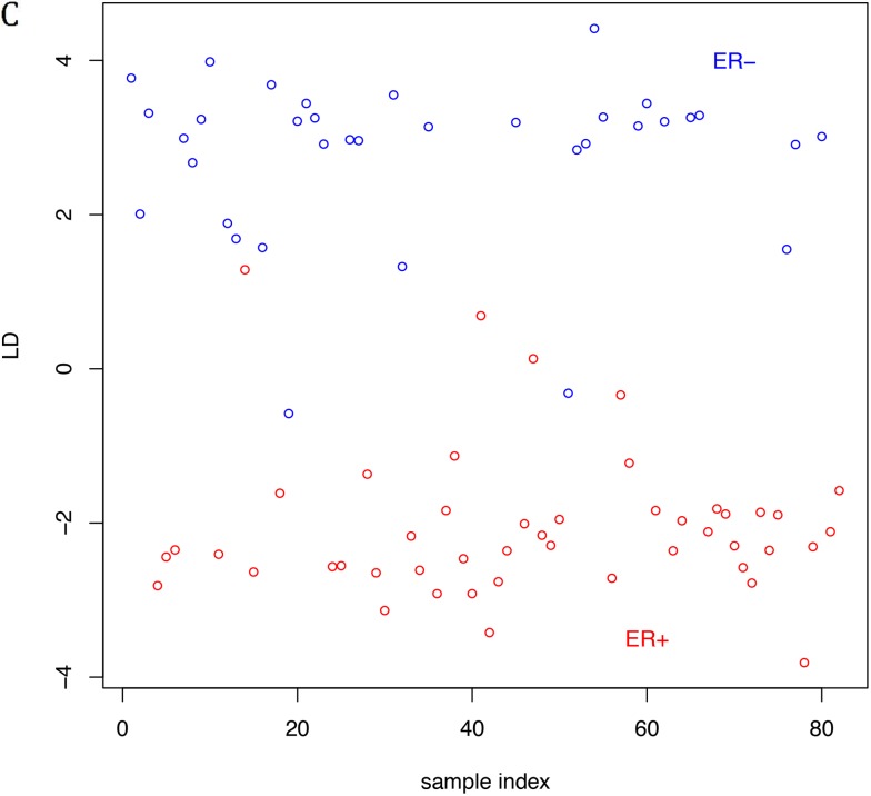
(A) Heatmap constructed based on clustering results from metabolite profiles of breast cancer (red) and normal (blue) samples. Heatmap features the top twenty-seven metabolites as identified by t-test analysis (p≤0.05). Distance measure is Euclidean and clustering is determined using the Ward algorithm. (B) Linear discriminant analysis of breast cancer samples according to race. LD plot generated for African American (black circle) and Caucasian women (red circle) breast cancer tissues. (C) Linear discriminant analysis of breast cancer samples according to hormonal status. LD plot generated for ER- (blue circle) and ER+ (red circle) breast cancer tissues.


