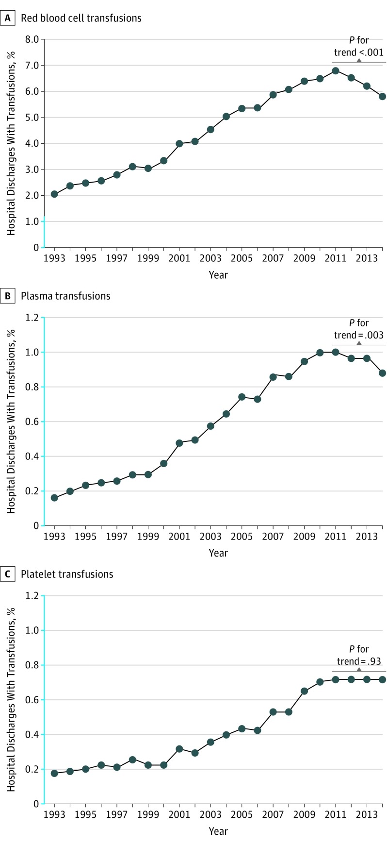
Figure. Temporal Trends in Red Blood Cell, Plasma, and Platelet Transfusions Among US Hospitalizations, 1993-2014.
The y-axis scale shown in blue indicates range from 0% to 1.2%. The graphs represent the proportion of discharges transfused with a given blood component each year. The data represent weighted estimates for 33 million to 38 million discharges each year in the National Inpatient Sample (1993-2014). The P values for trend shown were calculated by the Cochran-Armitage test for linear trend in transfusion from 2011 through 2014.

