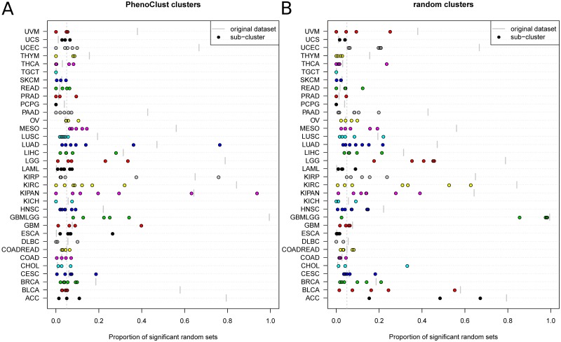
Fig 2. The effect of clustering on random bias.
Each horizontal line represents a single TCGA dataset, where the location of each dot along the x axis represents the proportion of significant sets in a single cluster and the location of the short vertical gray line indicates the proportion of significant sets in the complete dataset. Both proportions were calculated using random sets of size N = 64. A. The analysis using the phenoClust clusters B. The analysis using random sub-sampling of the datasets with groups of samples of the same size as the clusters determined by phenoClust.

