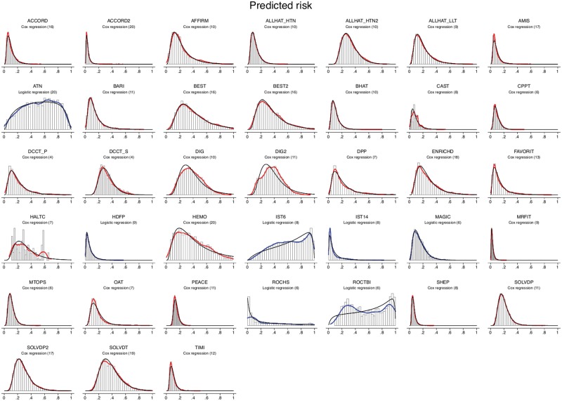
Figure 1.
Risk distributions. The histograms show the distribution of the predicted risk for the outcome of interest. Curves shown in red are fitted to the distribution of predictions generated by Cox models; curves shown in blue are fitted to the distribution of predictions generated by logistic models. Fitted log-normal curves and fitted logistic-normal curves are also shown for the Cox- and logistic regression-generated curves, respectively. As can be seen, these log-normal and logistic-normal curves approximate very well the red and blue fitted curves. Note: The FUTURA Trial is not included in this figure since we could not export individual-level patient predictions from the site in which the data were housed.

