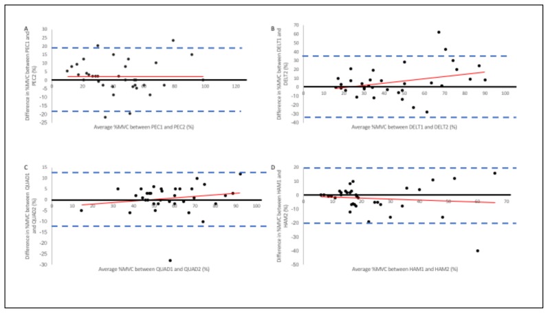
Figure 4.
Bland & Altman Plots for A) RPEC, B) RDELT, C) RQUAD, and D) RHAM. The vertical axes represent the difference in %MVC between the first and second %MVC measurements from SA (smart apparel). The horizontal axes represent the mathematical average for each participants %MVC measurements. The solid dark line represents the ideal lack of difference between the two %MVC trials. The dashed lines denote the upper (+2SD) and lower (−2SD) limits of agreement

