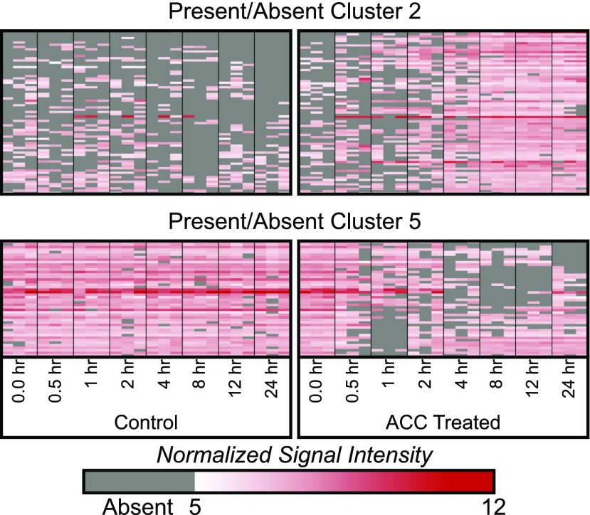
Figure 3.
PA analysis reveals additional genes with consistent, time-dependent changes in transcript abundance. Heat maps represent patterns of transcript abundance for two representative PA clusters. Columns represent three replicates for each time point; each row is an individual transcript. The white-red color scale represents the normalized signal intensity, and gray designates absent values that did not pass the Affymetrix detection cutoff.

