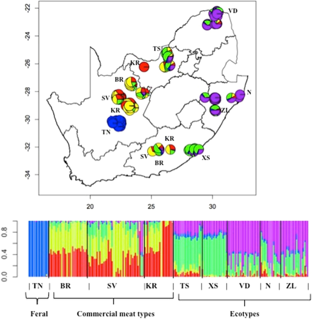
Fig. 1.

Map of South Africa. The ADMIXTURE plot represents average membership coefficients resulting from the genetic structure analysis (best fit model, K = 5). Each color represents a different gene pool. The included barplot represents each accession as a single vertical bar broken into K color segments, with lengths proportional to the estimate probability of membership in each inferred cluster. The breeds are represented as: TN Tankwa, BR Boer, KR Kalahari Red, SV Savanna, TS Tswana, VD Venda, XS, Xhosa, N Nguni, and ZL Zulu
