
Figure 2.
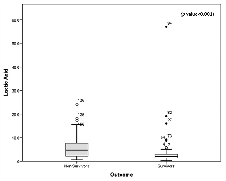
Comparison of lactic acid (in mmol/L) between survivors and nonsurvivors. Data are presented as box plots with median lines, 25- and 75-percentile boxes, and 10- and 90-percentile error bars. The circles represent the outliers
Official websites use .gov
A
.gov website belongs to an official
government organization in the United States.
Secure .gov websites use HTTPS
A lock (
) or https:// means you've safely
connected to the .gov website. Share sensitive
information only on official, secure websites.
Comparison of lactic acid (in mmol/L) between survivors and nonsurvivors. Data are presented as box plots with median lines, 25- and 75-percentile boxes, and 10- and 90-percentile error bars. The circles represent the outliers