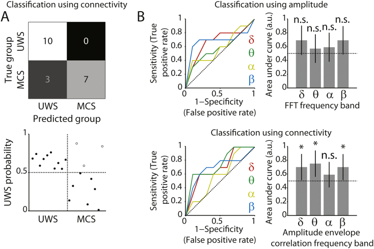
Fig. 4.
Classification between patient groups. A) Top row, confusion matrix for classification distinguishing UWS from MCS patients, based on connectivity (δ, θ, β bands). Colors indicate the relative number of cases in each cell. Bottom row, associated classifier weights. Filled and open dots show correctly and incorrectly classified patients, respectively. B) ROC curves and corresponding areas under the curve, indicating the extent to which each frequency band contributed to the classifier. Top row, for spectral amplitude. Bottom row, for amplitude envelope correlations. The area under the curve can be interpreted as the accuracy with which the individual participant/patient's group can be predicted based on the metric in that frequency band. The horizontal dotted line indicates chance performance. Error bars denote the 95% confidence interval of the permuted null distribution. *p < 0.05; ***p < 0.001; n.s. non-significant.

