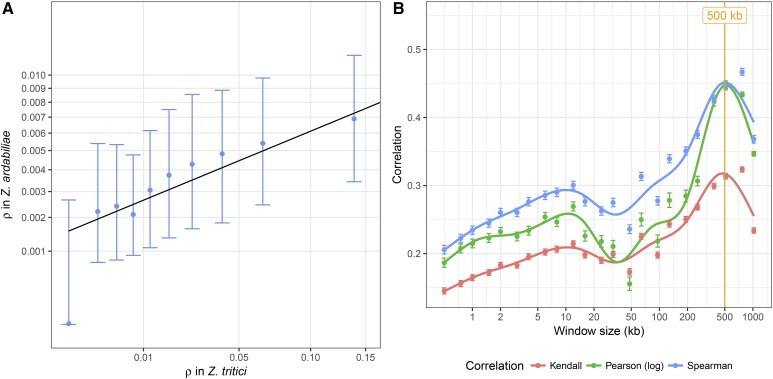
Figure 7.
Correlation of recombination maps of Z. tritici and Z. ardabiliae. (A) Comparison of the two recombination maps based on average recombination rates in windows of at least 100 SNPs in each species. Points represent averages in 10 classes with equal numbers of windows; points and error bars represent the median and first and third quartile of the distribution for each category. (B) Correlation of recombination maps in sliding windows of different sizes. Three distinct correlation coefficients are plotted against recombination rates averaged in different window sizes (see Materials and Methods). Points indicate the averages of 1000 samples and bars shows the SEM. Lines correspond to local regression smoothing.

