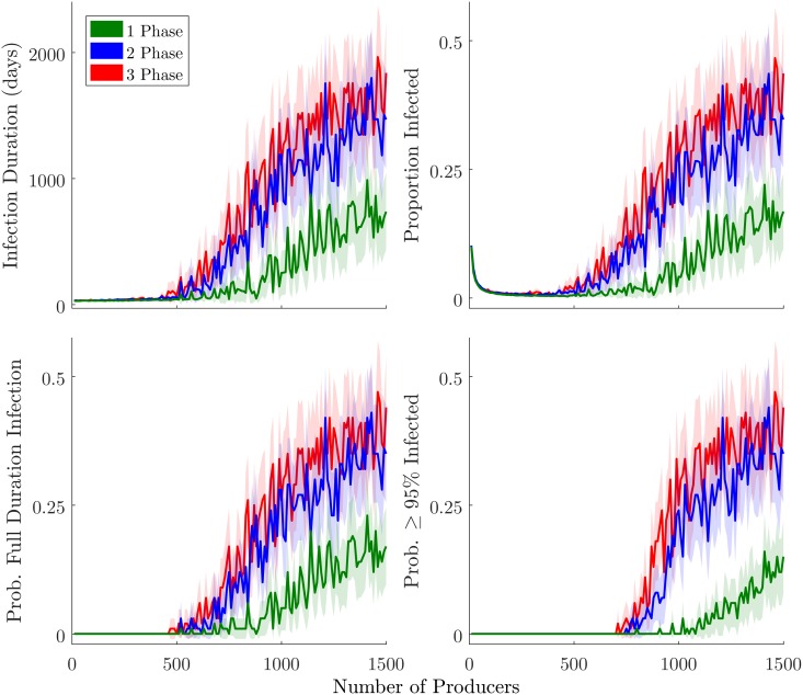
Fig 6. Percolation threshold visualizations.
Lines plot average values for the 100 runs at each of 150 Np levels, with corresponding color fields indicating 95% CI. Top left plot shows infection duration. Top right shows mean proportion infected (cumulative). Bottom left shows the fraction of runs resulting in a systemic network-level infection lasting the full duration of the model run (4135 model days). Bottom right shows the fraction of runs in which 95% or more of the agents became infected.

