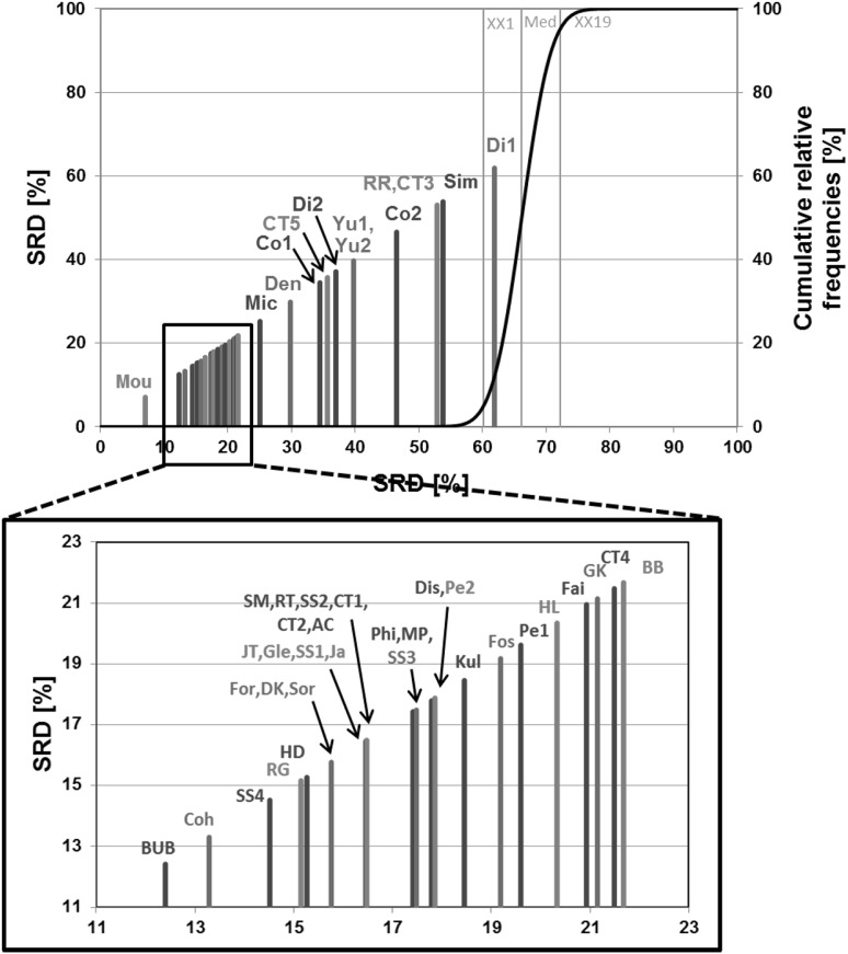
Fig. 2.
One example of the SRD results (Dataset 3). Normalized SRD values (percentages) are plotted on the X and left Y axes. The cumulative relative frequencies of SRD values in the randomization test (%) are plotted on the right Y axis. (The original plot was magnified for better visualization). (Color figure online)

