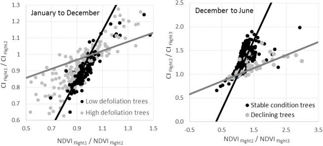
Fig. 14.
Left panel: CI change rates vs. NDVI change rates using data from hyperspectral Flight 1 (January 2014) and Flight 2 (December 2015) to distinguish between trees showing low and high levels of defoliation. Black and grey lines show the boundaries of the space occupied by the trees and set a baseline for healthy and declining trees, respectively, according to the model simulations (see Fig. 10). Right panel: CI change rates vs. NDVI change rates between hyperspectral Flight 2 (December 2015) and Flight 3 (June 2016) for trees identified in the field as being in stable condition between both dates and those whose health had declined. In the space defined by the two change rates, the former trees remained on the healthy baseline, established using Flight 1 and Flight 2 data, while the latter trees fell on the decline baseline.

