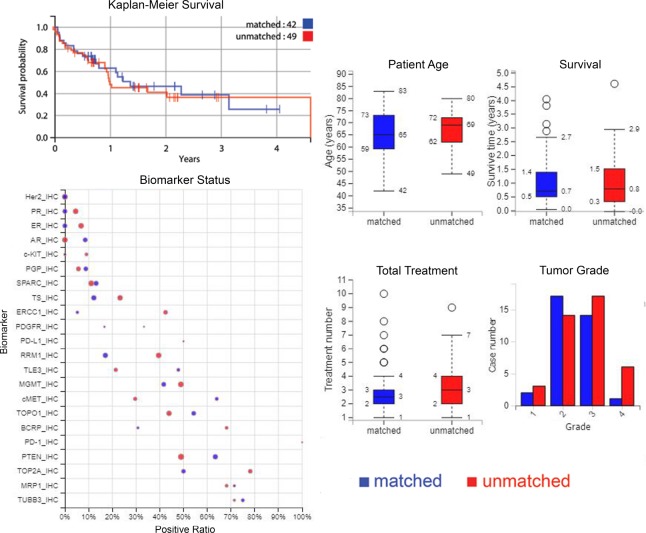
Figure 1. Plots of survival, biomarkers, and patient, treatment and tumour characteristics.
Upper-left: a Kaplan–Meier curve showing overall survival from time of profiling for matched versus unmatched treatment groups. Lower-left: comparison of biomarkers between matched and unmatched where positive ratio gives the percentage of cases that have “positive” biomarker results i.e. for IHC tests, positive is protein expression above a certain threshold, and for sequencing biomarkers, positive is a gene mutation. The size of the circle represents the number of cases. On the right: age of patients, survival time, treatment numbers, and grade of samples, where blue is matched patients and red is unmatched patients.

