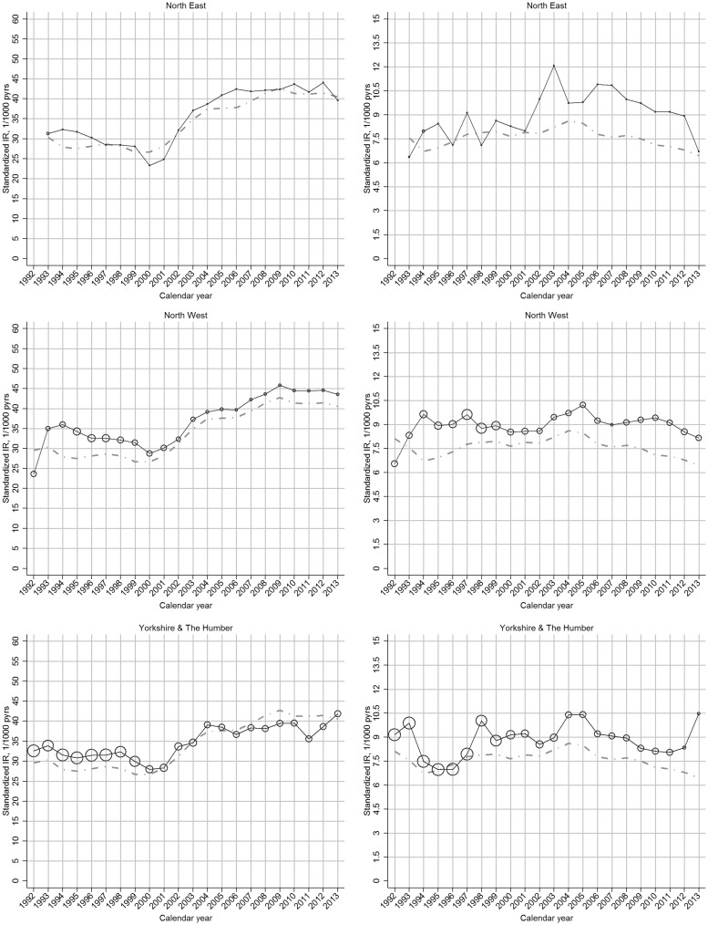
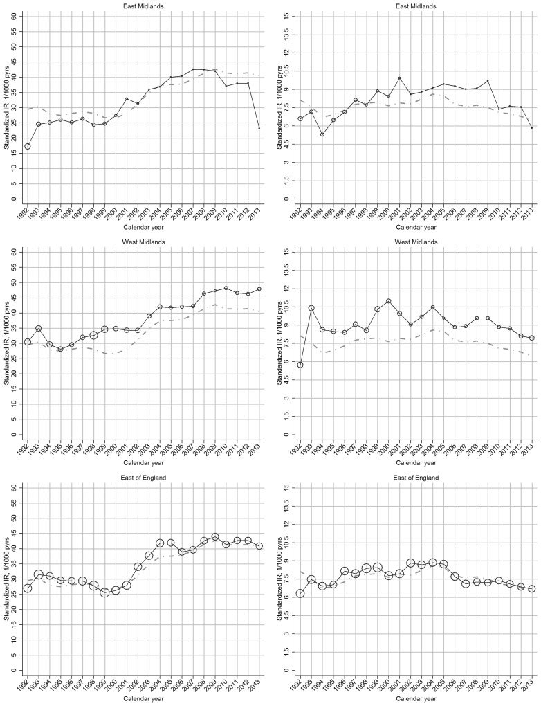
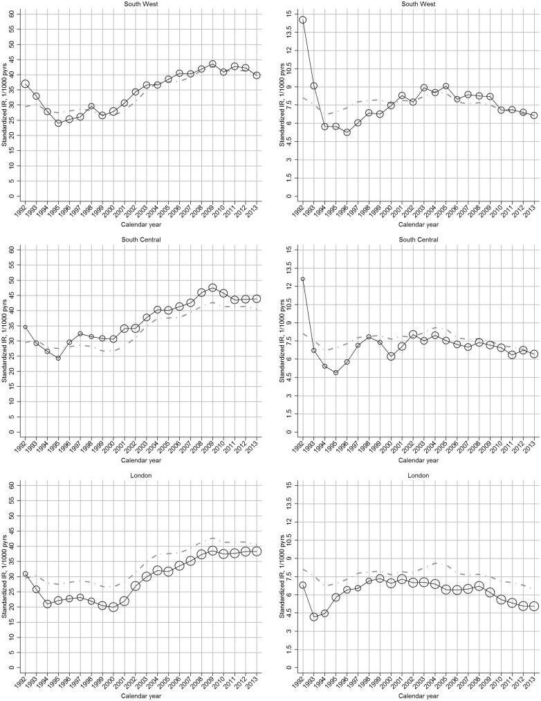
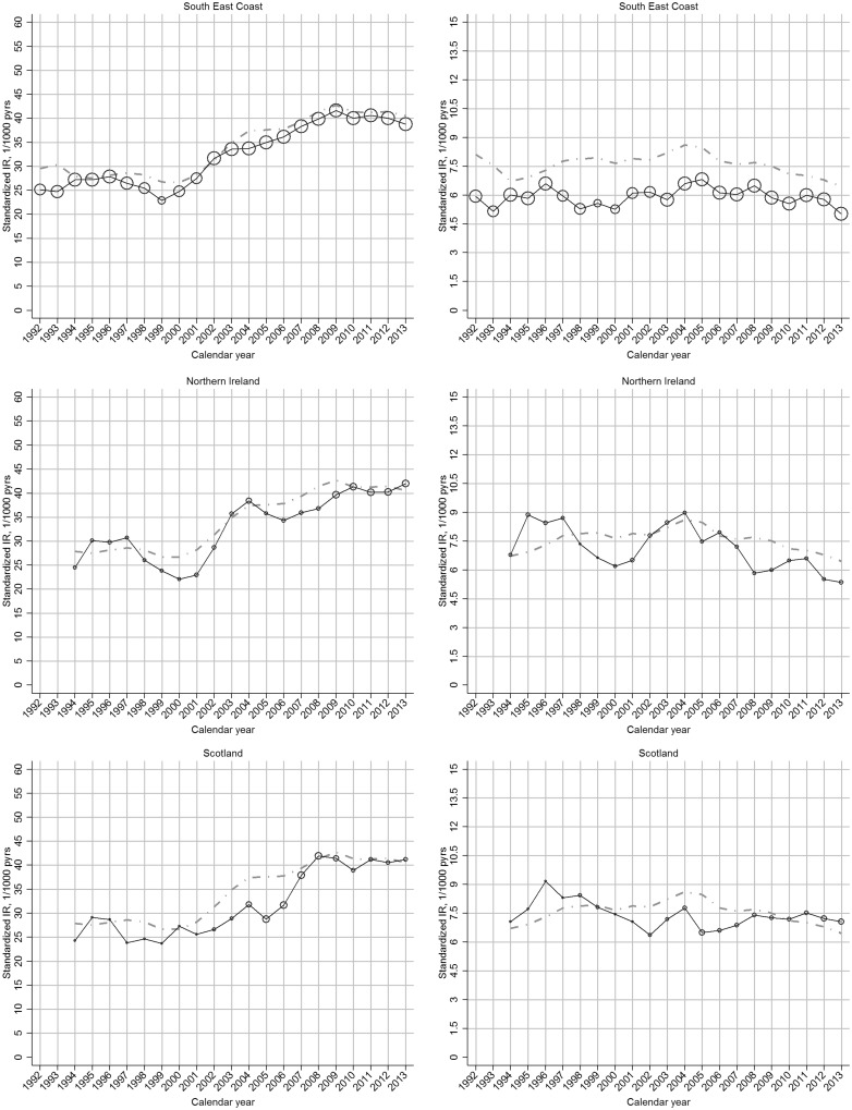
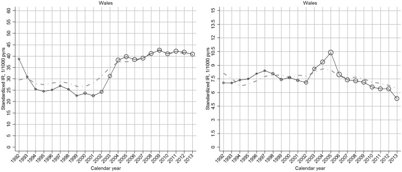
Fig. 2.
Region-specific temporal trend in incidence rate of OA, by gender: UK, 1992–2013
Left panel: clinical OA; right panel: OA. In each plot, the black line represents the trend of overall incidence in the specific region; the grey line represents the general trend of overall incidence in the UK; the bubble size in each calendar year is determined by the proportion of the overall at-risk population within that region.

