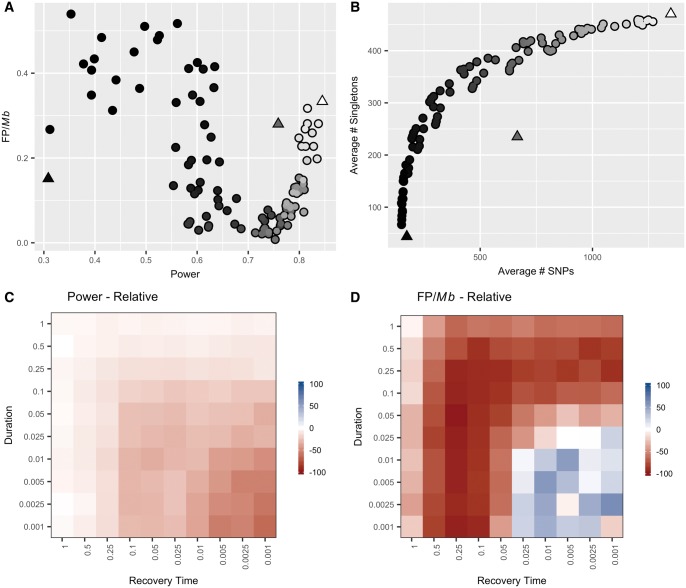
Fig. 4.
The relationship between power and false positive frequency following a population expansion is complex and depends upon both timing and duration. (A) Each point (circles) on the plot indicates the power (x-axis) and false positive frequency (y-axis) following a population expansion that varies in duration and recovery time. The power, but not the false positive frequency, fell within the range observed among the equilibrium, control populations (triangles). The shading of the points represents the average number of SNPs per simulation, which directly corresponds to the values on the x-axis of (B). (B) Following an equilibrium demographic history, there is a constant linear expectation for the relationship between the number of SNPs and the number of singletons (triangles). Population expansions result in the observation of more singletons than expected given the number of SNPs (circles). The shading of the points corresponds to the average number of SNPs per simulation plotted on the x-axis. (C) Each square in the plot represents the relative power to detect a hotspot for a population with a population expansion of a given duration (y-axis) and recovery time (x-axis) compared with a control equilibrium population of the same ending size (N0= 10,000). Power was calculated as the percent of measurable simulations for each condition in which the true recombination hotspot was significantly identified by LDhot. (D) Each square represents the percent difference in frequency of false positives observed per Mb following a population expansion relative to a control, equilibrium population of the same ending size (N0= 10,000). The false positive frequency was calculated as the total number of false positives identified per condition divided by the sum of the measurable length per condition.

