
Fig. 7.
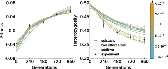
Comparison between experimental (black dots) and simulation (lines) fitness and heterozygosity data. Simulations shown are the ten runs with the highest log likelihood for each model among all measured parameters, with lines colored by the average selective effect of selected sites in the population. Because simulated populations are constrained to have the same starting variance in fitness, the total number of selected sites is inversely related to the average selective effect.