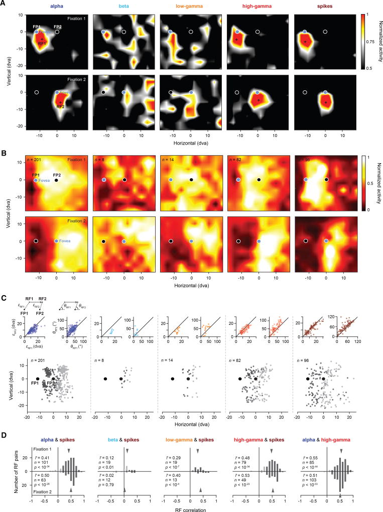
Figure 2. Retinocentricity of LFP- and Spiking-Derived RFs.
(A) Five example response maps derived from different LFP frequency bands (alpha, beta, low gamma, and high gamma) and spikes recorded simultaneously from one recording site. Response maps shown in the top row were measured during stable fixation at FP1 (fixation 1) (Experimental Procedures; Figure 4A). The cross in each map indicates the estimated RF1 center. Response maps shown in the bottom row were measured during fixation at FP2 (fixation 2). The cross in each map indicates the estimated RF2 center. The RFs have been spatially interpolated and smoothed for visualization.
(B) Population RFs based on all significant RFs from individual electrode sites as measured during fixation 1 (top row) and fixation 2 (bottom row). The population RFs have been spatially interpolated and smoothed for visualization.
(C) Populations of RF centers across fixations (RF1s in dark gray and RF2s in light gray). Insets on the top left of each graph show correlations between the distance from RF1 to FP1 (εRF1) and the distance from RF2 to FP2 (εRF2) for the respective population of RF centers. Solid lines depict the line of unity. Insets on the top right of each graph show the correlation between the two smallest absolute angles θRF1 and θRF2 formed by the horizontal meridian and εRF1, respectively ε′RF2 (Experimental Procedures). Solid lines depict the line of unity.
(D) Histograms of correlations between LFPs and spikes across frequency bands, based on pairs of significant RFs measured during fixation 1 (top row) and fixation 2 (bottom row). Rightmost histogram shows the correlation between alpha and high gamma. Darker bars indicate statistically significant correlations. Gray arrows indicate the mean of the respective distribution.

