
Figure 3.
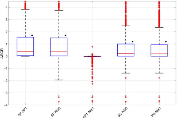
Boxplot representation of the distribution of ΔBGRI obtained comparing (a) SF versus OPT, SF versus NNC, OPT versus NNC, SC versus NNC, and PE versus NNC. Red horizontal lines represent median, boxes mark interquartile ranges, dashed lines are the whiskers, red crosses indicate outliers. Black dots indicate statistical significant between-distributions differences.