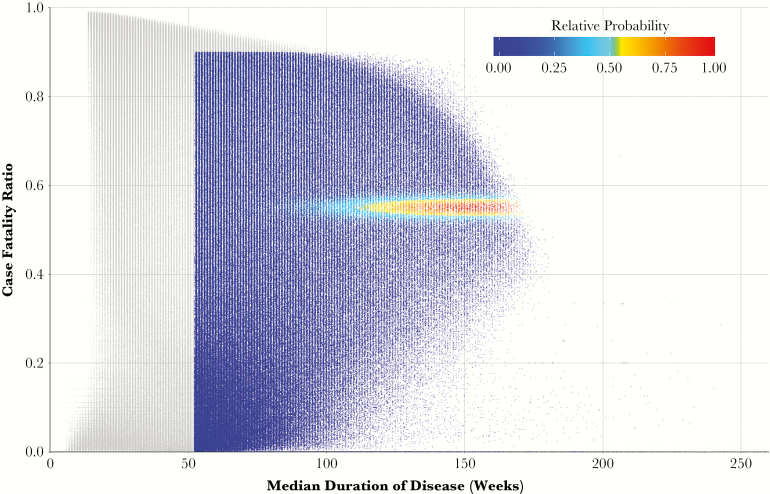
Figure 3.
Weighting process of 2 million simulated cohorts, according to fit with observed clinical data. Each point represents the results of a cohort of 1000 simulated patients, plotted according to the 5-year case-fatality ratio and median duration of disease amongst symptomatic patients who die or self-resolve. Each point is colored according to its weight (probability of being resampled to generate the final, or posterior, distribution), measured from 0 to 1 (the maximum likelihood of cohort results). Points colored in grey represent those cohorts with joint likelihoods equal to zero. (Not depicted are the 5% of simulations in which no patients developed symptoms.)

