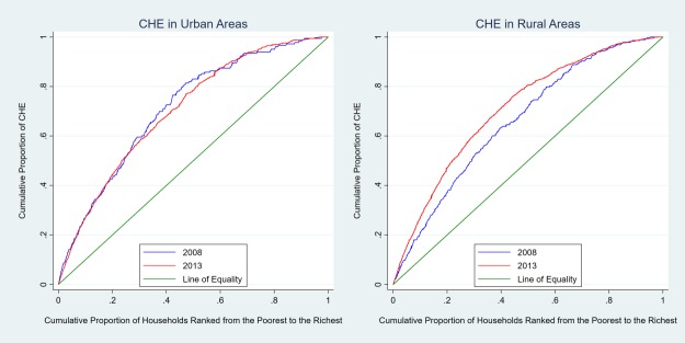
Fig 1. Concentration curves of CHE occurrence in urban and rural areas.
The right and left plots show the distribution of CHE occurrence by household economic status in urban and rural areas, respectively. The green line in both plots are the equality line. The blue line and red line in both plots above the equality line represent the concentration curve in 2008 and 2013, respectively. The further the concentration curve is above the equality line, the more concentrated the catastrophic health expenditure is among poor households.

